Upstairs

Our existing Living Room was alleviated of needing to function as four different rooms...now we can sit here to talk, listen to music, play music or just read.


The existing Dining Room has a new opening that opens on to the addition. The view from the door is centered on a column that is at the new center of the house. The new ceilings fold onto the column from different heights.
 |
| View from Dining Room to Breakfast area and Family Room |
 |
| view from Breakfast Area to deck and Dining Room |
Openings between the existing rooms and the addition flow together to form a cohesiveness that overcomes the stylistic differences. The existing house will be 100 years old in 2013 - though we didn't want the addition to look like it was a part of the original construction we also didn't want it to look starkly contrasting.
The addition was designed with modern California ideas of light and space, inside and outside, minimalist details and an open floor plan.
The Breakfast Area/Kitchen extension is the knuckle between the old and new house. The wall in this area completely tracks open to a second story deck.

Here is a similar view with the accordian door closed. A single column is the only vertical element in the new portion of the house. It marks the new center of the house between the Breakfast Area and the Family Room as well as the new geometric center of the house.
 |
The only wall between the breakfast area and the Family Room is a skinny cabinet aligned to the width of the stair down that leads between the two. The extra wood from the Family Room floor wraps up the side and top of the cabinet.


 |
The Kitchen is anything but minimal. It is active off and on throughout the day with people but alive in it's own right, filled with color and the remnants of smells and clutter. Drawings and recipes are posted on the refrigerator, growlers sit on the counter waiting to be filled. The Kitchen cabinets are steel lab cabinets from a nearby manufacturer painted with two different custom colors. The upper cabinets hold all of the cups, bowls and dishes - they are made of Europly which is a marine grade plywood able to take the abuse of a kitchen. They are open from the front and hang over the Breakfast Area for ease of setting the table and putting dishes away from the dish washer. |


Downstairs

The Master Bedroom has birch plywood walls and floor. Because the room is nestled into the hill and surrounded by trees we took advantage of the natural privacy of the surroundings and designed in floor to ceiling windows.
Using a butt glazed window at the corner and having the column outside the frame of the room makes the envelope of the room seem to disappear.

Our initial concept of building a modest "tree house" inspired the plywood finishes in our bedroom. We chose birch because it is highly figured and playful. Unlike the douglas fir plywood in the Living Room ceiling each sheet of birch has a different pattern. Putting them all together in the room was a design challenge but fun at the same time.


We haven't had time to finish the grading and landscaping yet but the eventually the idea is that the outdoor spaces flow similarly to the indoor spaces. The addition steps down with the hill so that it does not become too excessively tall on the down slope side like hillside houses can tend towards.

Exterior

There is nowhere that the tree house concept is more successful than looking back at the addition from the front yard. The reading nook in the Family room sticks out just two feet past the Master Bedroom below but because the corner of the bedroom is butt glazed it becomes transparent. A sizeable volume from the inside the Family Room seems modest in scale from out here and hides among the trees.


The upstairs and downstairs decks serve as the transition between the old house and the new addition - mediating the stylistic differences.
 |
| The back of the house does get tall at 35' above finish grade. The cast-in-place concrete stem walls are set back from the face of the house to give a vertical break to this facade. |
. |
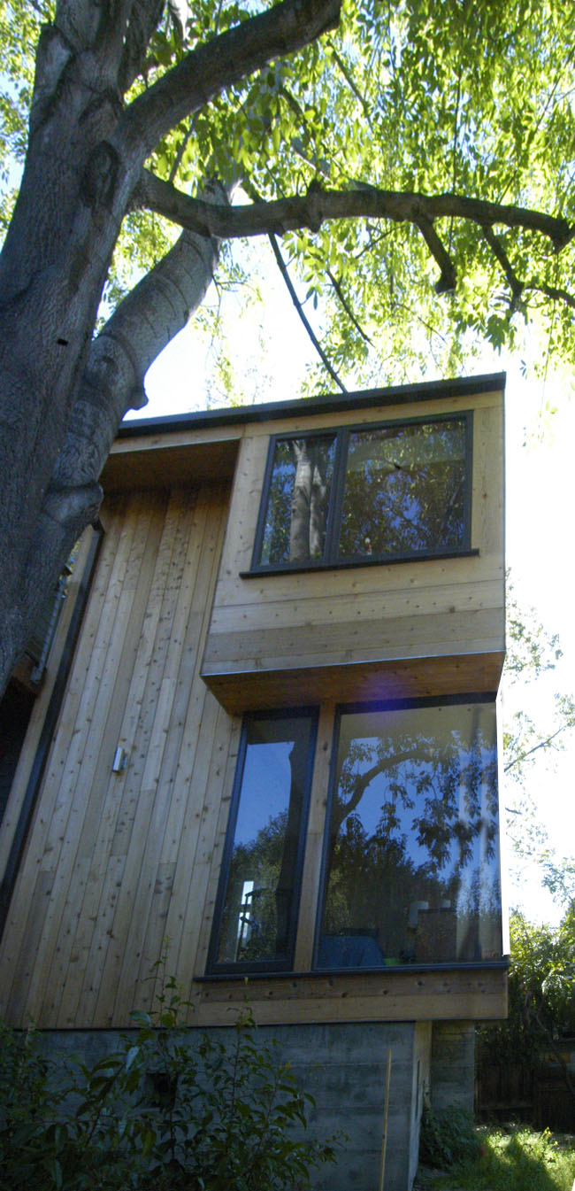
| The addition was sited as tightly as possibly between two major trees. The South side of the house abuts a 50' tall camphor tree that provides shade and passive cooling. The South side of the house also has few windows to help with heat gain. We designed in a bookcase in the Family Room and the Master Bathroom and Kids bathroom on the South side to take advantage of the window-free wall space. |
Bathrooms


The kids bathroom has a playful bright blue penny tile on the floor that continues into the shower area. The shower and back splash of the sink are clad in a long skinny white tile which keeps the bathroom bright and clean. The utility sink, locker cabinets and mirror are from Ikea. A clerestory window runs from wall to wall bringing in diffuse light because of the shade from the Camphor tree.


The window in the Master Bathroom runs floor to ceiling but is glazed with obscured reeded glass to just over 6'-0". The window is centered on the trunk of the Camphor tree.
The colors in the Master Bathroom are more muted - the floor has a brown-black tile and three sides of the shower are clad in a long skinny grey tile. Slot windows bring light to the back wall which is covered in an iridescent blue glass tile with a hexagonal pattern. The back wall changes color throughout the day as the sun hits it from different angles.


No comments:
Post a Comment